This article is also available in German. / Dieser Text ist auch auf Deutsch erschienen.
This text is part of the “UX Confetti Cannon”, a series of articles about the role of UX, design, our observations within the digital world of work and the different expectations towards the “magic” of user experience design.
Excuse me? It is 2023?
About 40 to 50 years ago people built the first software for personal computers (PCs). Product teams in the US began employing the technique of Rapid Paper Prototyping when creating their hardware but mainly software products. In the 1990s, when this kind of prototyping became very popular, there was no virtual whiteboard software, no widely-accessible design/prototyping tools like Balsamiq (2008), Sketch (published in 2010), Zeplin (2014) or Figma (2012). Most „designers“ back in those days have to be proficient in GUI (graphical user interface) development; means coding. At today’s digital product industry, technical barriers have fallen and the tools got some awesome usability and amazingingly helpful features. But nevertheless: for me there is at least one „oldtimer“ that still remains: prototyping, RAPID prototyping and sometimes rapid PAPER prototyping. On the following text you’ll find my day-to-day reminder around:
WHY PROTOTYPING? An updated „Version 2023“
for people, who are working in todays digital product industry.
If I (get forced to) have an idea for an app, software, platform or feature, I do: a bunch of notes, talk to multiple people and sketch various ideas in my notebook or on a whiteboard – everything by hand with a pen. Mainly everything happens physically when I kickoff a new topic. Doing it this way supports my way of thinking and helps me to combine user needs, business needs and eventually stakeholder needs.
However, when some of my (junior) colleagues have to handle a new topics, they tend to opened Figma and start designing. Some may also research through google, behance etc. But jumping right into any design software might lead to nowhere: They already start to think about colours, fonts, headlines and components and about designing with them. They get overloaded by design choices initially. Its a common trap for every designer, coder or consultant out there: We are jumping into a tool, which we know very well and had some great results in the past. We jump right into solutioning and getting some answers designed – ideally to present them.
Yes, in our todays reality we are getting nudged to jump over various steps in the design process [2]: there might be the case we are not enough people at the software project, there is no insight around the business requirements, we do not have enough time before the release date, we do not have the experience maturity within the teams, AND design leaders are experiencing pressure from „above“. In reality, designers „have to deliver through capacity“, without any input about why the user wants to do something and with very basic knowledge about frontend or backend architecture and/or legacy. While running a software, we might find out, we cannot learn from the live environment as well from users behavior, because we do not have any or sufficient analysis and tracking tools running; or more often: no team to work on that. The most common thingy: software organizations are not built around user’s needs and data. But because complaining gets you nowhere:
First, designers might need to internalize, why we should use the rapid prototyping method for
- to be most efficient to get into the topic?
- to get fast through some rough ideas and iterate them?
- to get to know the people in the project team and client-side?
- to start building a trustworthy relationships with all around you?
- to co-create with user’s input?
What are rapid prototypes for?
Designers are also consultants. Depending on the company’s culture and UX maturity [3], first and formost: Designers are inhouse consultants. We are used to give and receive feedback about our work since ever. Although our colleagues might not be the targeted users at all, everyone is having an opinion about the design, look, layout, wording, etc. In fact, what most people expressing is their feeling over something. And while, most of the time, the „democratization of design“ is annoying from a professional point of view (also because this puts pressue on designers which are feeling „not ready“ to show their work „someone“) this is also a opportunity.
It’s common knowledge that communication is key, but when building a software with an user interface, it needs to be also visual communication. It is more easy to talk about some drafts which people can see (and feel) rightaway, instead of having dozens of theoretical meetings around meeting notes or backlog tickets. Especially, if there is no tangible output for the product designers.
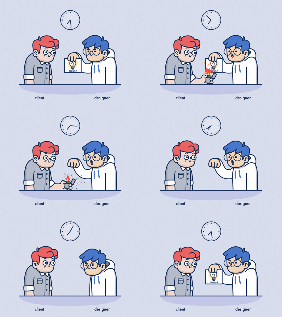
[Image source © Giphy]
While not everyone is a designer, and designers might have already some ideas in the head, most of the people in the project are not (visually) creative. So when kicking off a topic, it is a good idea to do some rough user flow and prototyping sessions, sometimes even with your colleagues together. So you, product designers, do create something to communication and co-create on. Not only, you do have an outcome afterwards, you get to know your colleagues better and you can put them a bit into your shoes. More than once, I heard from someone: „Whoa design is a complex thing.“ Co-creating with colleagues and costumers does not only strenghten the relationships, you can make sure that the terms everyone is using indicate the same meaning and that expectations can be discussed while looking together on a rough design. It is a good starting point to talk about the roadmap, about the scope yet.
Also, when co-creating something, it will never be the idea and design of one single person, e.g. designer, only. It is more inclusive. Secondly, no software design should ever be based on only one input and skillset. And thirdly, designers could toss out prototyped drafts and ideas more easily: In general, it is better to draft quicker and more regular with stakeholders together, so designers do not fall into the common „visual trap“ (fall in love with their design too quick or at all). It helps actually a lot if you do not do some product design on your own initially, because you might get for too long, too deep and/or in the wrong direction with your thoughts and designs. It is even better to partner with your costumers, colleagues and the users over a problem. It avoids or solves even conflicts better: instead of having a polished draft between the designer and the stakeholder, where both sides do have strong opinions about, both are standing side by side and creating and looking together at the problem and eventual first results.
You, designers, know already your stuff, based on your experience.
So initially it is all about other people. Their needs. Their experience. Their input. With rapid prototyping, designers can test initial ideas in front of those people as soon as possible.
But PAPER? When? What?
Disclaimer: Of course, the fidelity of your prototype should match with your way of thinking and knowledge about the product and it’s vision. If you are working remotely, you could also draw digitally.
How will you know, when it’s right time to show your idea to someone else? You might ask yourself, if your ideas are ready to be put in front of other people? It is simple:Yes! Don’t be afraid to share your drafts, notes and paper prototypes ealy and often, in order to get feedback and some guidance for your next steps and design decisions.
- Initially we, designers, use paper sketches or protypes because they are fast, easy to design, easy to throw away and very hands-on
- Not only in product/software companies, designers start the design process with something that is handy, look quite simple and rough (it’s rapid) such as a paper prototype;
- Designer use it also to get from consulting to a talk on a level playing field over something tangible
- Users express an above-average number of suggestions on such prototypes
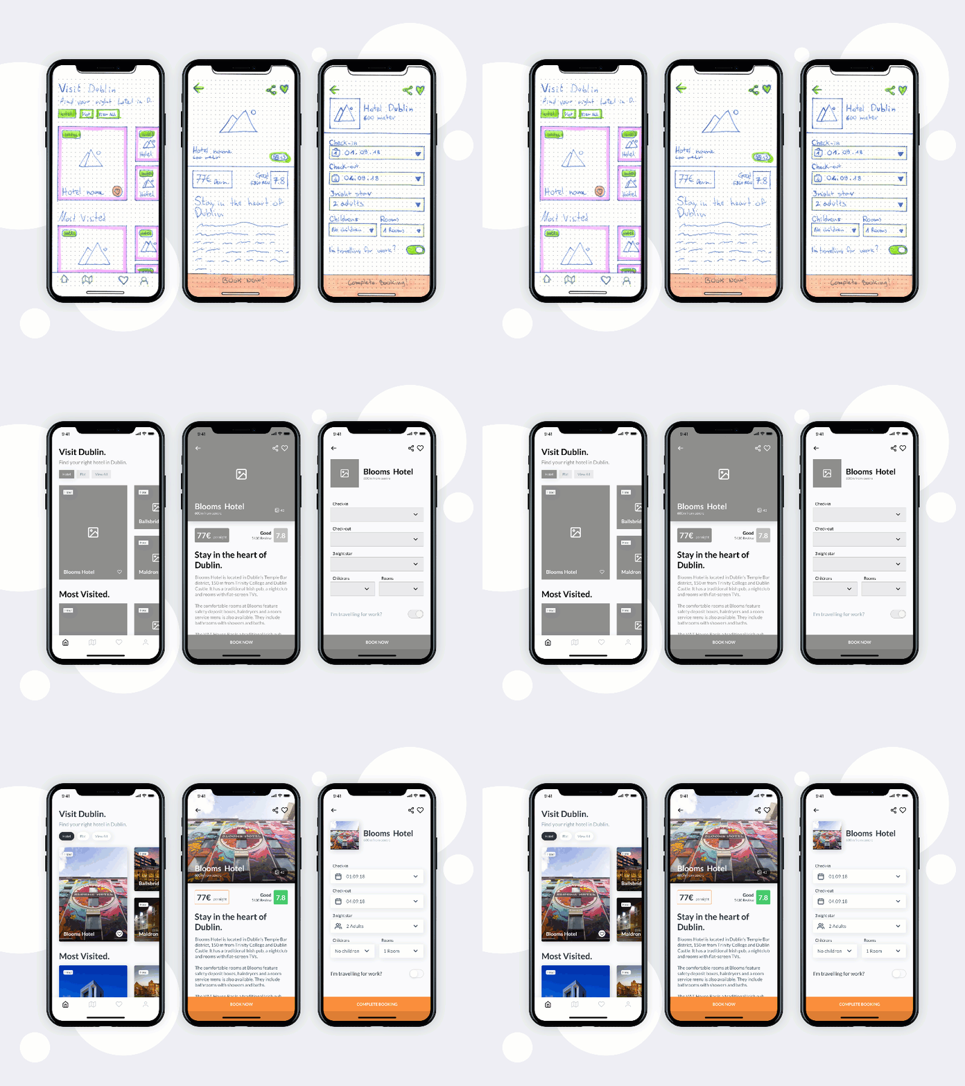
- After kicking off with rapid paper prototypes, we are using design tools to create more high-fidelity mock-ups
How could you make it work?
- Rapid Sketches (via pen & paper)
- note every object and function a user might interact with
- outline the steps for only one linear user flow (per prototype)
- show the basic app/software structure (could also an upfront workshop, with card sorting etc.)
- explore a variety of layouts (wireframe-style)
- With the Rough Layouts
- go and get some feedback <-> with workmates
- use it as a communication base <-> with team / clients
- set a test story
- discuss about the information achitecture
- conduct (usability) testing <-> with users
- do some co-creation sessions <-> with your stakeholders and users
- With some Agreements & Insights on the rough layout
- after flushing out all your ideas on paper the faster you will be on your computer
- put your layouts into a rough digital prototype
- send the prototype & flows to users & other stakeholders
- also at this step: it’s faster to communicate and validate your new ideas through sketches, before you have to make those changes to your digital prototype or mvp
While iterating and skribbling, keep the following reasoning in mind constantly: rapid paper prototyping is a method to test and set key decisions about how the product should be designed.
Futher tips and tricks

- Put 1 pen, 1-2 color pencil and paper (or your notebook) on your desk or next to it
- Learn some easy shapes for typical design components (H1, buttons, texts, slider etc.)
- Combine the component/shapes with little text
- Keep the text as crisp as possible (naming your H1 or key objects might be enough)
- For a consistent use: set one primary color for attention and avoid color elevation and shadows initially (e.g. after some iterations, I use only one or two primary colors to keep an eye on users attention areas)
- To avoid traveling with your paper prototype from meeting to meeting: record the flow and interactions with your phone, create an animated gif (by taking a few stills and put them together)
- to avoid redrawing all the common elements of your product: use a stencil, print out existing screens or common interface components (remember: it’s not about training your art skills, BUT to explore the interactions and natural transitions between screens and user’s thoughts and behaviour)
- Yes, you can also draft your ideas and designs on a virtual whiteboard, but especially when jumping into digital prototyping: when sketching ideas, only use easy shapes instead of actual design components.
- As soon as it’s about overall costumer journeys [4] and their flow landscape, any visual language, arrangements, APIs, writing and wording, you are leaving the low-fidelity state and it’s okay to work out your designs with your dedicated software, because now a greater similarity to the final product gets into picture 🙂
And now?
Start to sketch your ideas with a pen and some paper. Think in processes, flows and information hierachy. Talk with the rapid prototypes in your hand to: users, costumer service agents, architects, researchers, industry experts, developers, delivery management, clients and QA colleagues. Remember: You are not alone.
Dear product and software people: Speak up, open up and co-create together with the people around you to design a usable, feasable and sustainable (software) product. But start with the very first step: a rapid (paper) prototype! ✊
Sources
Image Source (Header): Photo by Med Badr Chemmaoui on Unsplash
References
- [1] Rapid prototyping
- What is Paper Prototyping, published on interaction-design.org
- Physical Prototyping, Interaction Design Journal (Blog) by Kornelia Papp
- Paper Prototyping: Wie man prototypen mit papier erstellt & testet (Subtitle available), published on YouTube by NNgroup
- Rapid Prototyping: Digital, published on YouTube by Google for Startups
- Jumpstart your Rapid Prototypes with Figma published on figma.com
- [2] Design Processes (nope, there is no „one-fits-all solution“, sorry), e.g.
- Lastest Design Double Diamond : How to apply a design thinking, HCD, UX or any creative process from scratch, published on medium.com by Dan Nessler
- Design Sprint : the design sprint kit (learning community, featured by Google) | The Sprint Book by Jake Knapp
- [3] UX Maturity, e.g.
- The 6 Levels of UX Maturity, from nngroup.com
- Four Factors in UX Maturity, from nngroup.com
- [4] User flows, Costumer Maps, Experience Maps, e.g.
- Customer Experience Maps – 8 Things You Should Know published on medium.com by Spotless
- User Journeys vs. User Flows published on nngroup.com by Kate Kaplan
Disclaimer: Similarities to living people or real events are incidental. This text reflects the opinion of the author. The article does not necessarily reflect the opinion of their employers. Since I am phrasing e.g. “user”, “designer” or “colleague” here, I what to highlight our gender-inclusive intention at creatives-forever.com


very good submit, I certainly love this website, carry on it
Great read! I will continue to exchange on my ideas with colleagues, and all my initial ideas are going into a notebook anyways
Hello there, you have done a great job. I will definitely digg it and personally recommend to my friends. I am confident they’ll be benefited from this magazine.
Nawww – I’ll read this again before the next project! Thank you!
You name it! will send this my engineering mates!
„So you, product designers, do create something to communication and co-create on.“ -> and yet, many designers spend hours to tidy up ui/designs in order to prep a exchange with their stakeholders 😉
Really insightful post — your article is very clearly written, I enjoyed reading it and will share it with some of my design friends.
I started writing down one thing at the end of every day — what I actually managed to do. Not a to-do list, not plans. Just one small win. It’s surprising how quickly it shifts your perspective.