Abstract
Todays task was to draft with our dedicated tool, an icon set for an fictional restaurant menu. The icon set should include an icon for starters, main course, dessert, drinks (non-alcoholic) and drinks (alcolholic).
| Tools | Adobe CC Illustrator (Christina) – Microsoft PowerPoint (Christoph) |
| Timing | 120 minutes |
| Date | 11.02.2023 |
| Participants | Christina & Christoph |
| Deliverables | 5 icons, with a consistent, similar look and feel |
Initial ideas and skribbles
… from Christina
… from Christoph
The 2 icon sets within 120 minutes
… from Christina
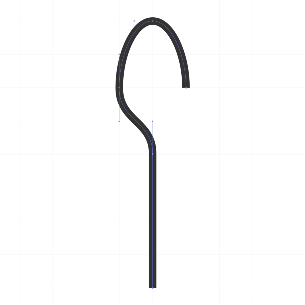
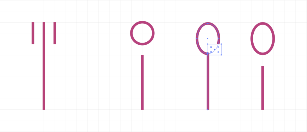
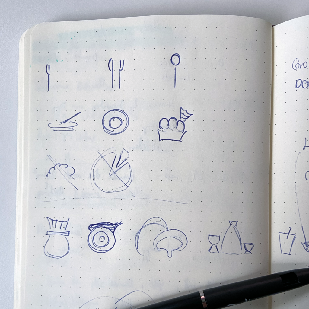
Christina: „Within 120 minutes it was though to create a familiar look and concept.
So my priority was to design icons that were as simple as possible, I also wanted to adopt the clean look of e.g. a san-serif font.
While I wanted to experiment only with lines in black/white and positive/negative spaces, it was clear, that food-related icons needs to look a bit organic, round.
With every line and anchor I asked myself, until when is it enough line to make someone understand WHAT the icon is standing for.“
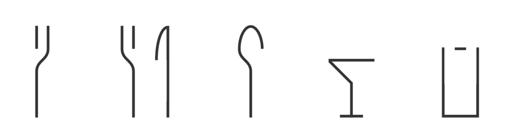
I was truly amazed by Christinas approach. She did this very straight forward and with an awesome approach. I liked, that she did it with Adobe Illustrator and you can see her skill with graphic design tools. The design language of the five icons is very amazing and I could literally see them in a modern cuisine menu right before my eyes!
Christoph
… from Christoph
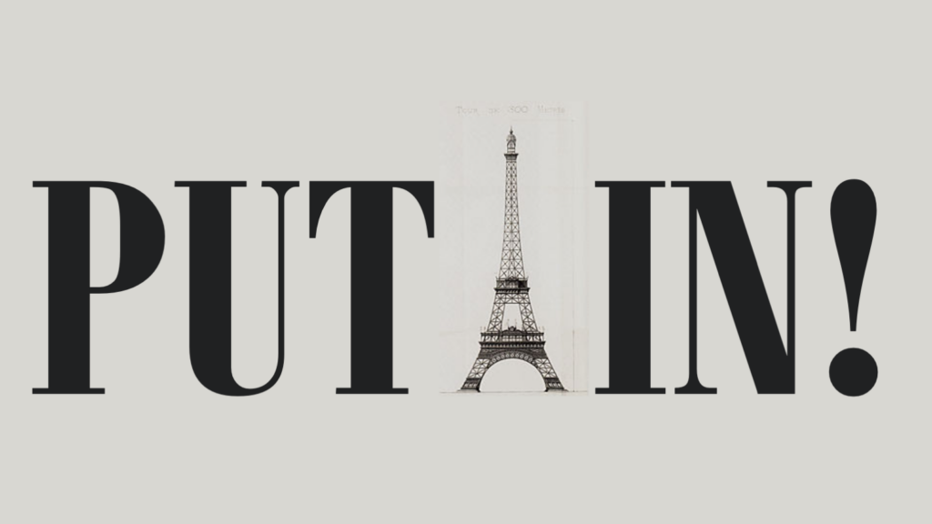
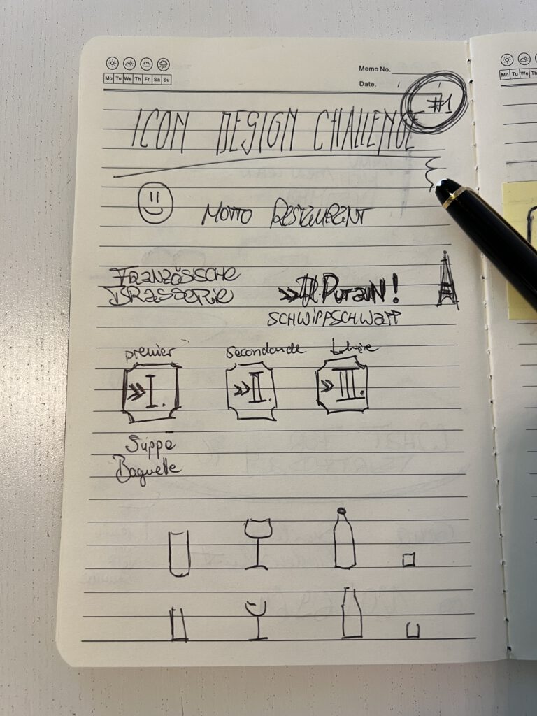
Christoph: „I am honest with you… It was a very difficult task for me! Some first ideas came into my mind very quickly. I wanted to do some icons for a french restaurant, »une brasserie«. I was instantly so hooked from that idea, that I got myself lost in research. But thats something I always do: collecting as much inspiration as I can. So I opened up a PowerPoint and filled it with lots of pictures I found that could inspire me: Pictures from actual brasseries, pictures of France around 1890, old posters and menus. I was amazed by the visual style that came up during (french) industrialization.
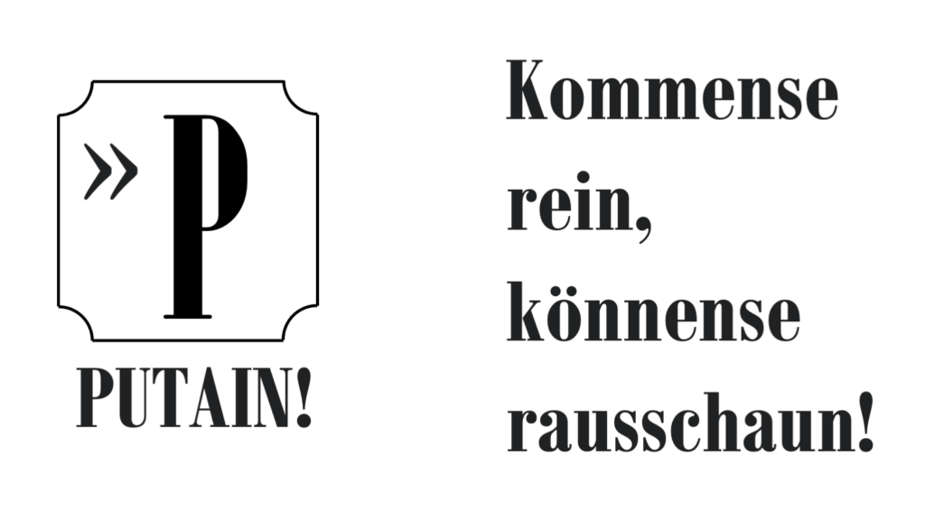
So time flew by and I had created nothing so far. In the very last minutes I came up with an idea to shape my icons around the three different courses and give them an „past“ visual appeal (also in PowerPoint). Unfortunately, I had no time to create icons also for beverages. And I have to confess: I am in love with Guillemets! In the outtake section you will also see an excursus I did: I developed a name and a slogan for my restaurant »PUTAIN! – kommense rein könnense rausschaun (come in – look out)«. Catchy, non?“
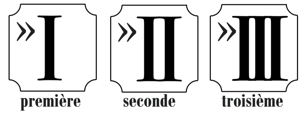
While I understand that Christoph lost himself in the idea and research about brasseries, art deco and France, it’s not easy to feedback the results. While there seems to be a clear idea and he worked with moodboards, he was only able to design with 3 of 5 icons. I would have been curious, how he designed alkoholics and non-alkoholic drinks!
Christina
Outtakes