This article is also available in German. / Dieser Text ist auch auf Deutsch erschienen.
Barcamps are fun, they are for everyone, they are inclusive, they are for free. Everyone is allowed to speak and it’s a safe space. I am visiting barcamps since 2015. And I am a fan. I truly believe in this kind of ad-hoc „unconferences“, born from the desire of individuals, who want to share and learn in an open environment. At these intense events, everyone is invited to contribute, share the desire to learn, have the ability to share experiences and is able to do own sessions, weather if it’s a talk, discussion, workshop etc. Because the barcamp attendees are the speakers. There is a common motto:
When you come, be prepared to share with barcampers.
When you leave, be prepared to share it with the world.
Recently, I was a presenter (we call it „session host“ at barcamps) at UXcamp Europe 2021 – the remote version. This event is one of the largest barcamps for UX Professionals with more than 1000 participants from all over the world. I was visiting this barcamp on site in 2019 (it takes usually place in Berlin once a year).
And, as we are encouraged to make sure that notes, slides, audio or videos of the presentations are published on the web for the benefit of all and those who can’t be present: I put an article around my session talk „How to unfuc* your form field“ together and recorded also a video. For those, who have never been to a barcamp, you can read about my recent remote barcamp experience here:
The Session Pitch
At the weekend of June 5-6, the UXcamp Europe took place. Of course online – due to global pandemic reasons. So everyone had to be a bit flexible with the „officially“ barcamp rules. Unlike the rule, that every session host is pitching the session to the whole barcamp audience, this year every registered session host got access to the session board (provided on Miro, a whiteboard plattform tool) one day BEFORE the 24h-UXcamp. This time – due to openless resources regarding virtual meeting rooms – we, the session hosts, were able to pick any time slot and filled out our session card at the 24 hours – session board.
For registered session hosts the UXcamp-organisation team provided also two optional Q&A sessions on the day before barcamp started. Every host put the own session card at the Miro board. The board got locked, shared and was made available to the whole audience during the barcamp event.

©Christina Humpf
On non-remote barcamps, speakers pitch their session in front of the whole barcamp audience. If the audience feedback (applause) is loud enough, the session is voted democratically and got placed on the session board (timetable), sometimes in parallel to other sessions. To sum it up, all details around a session are also filled in a session card and come with a short „live pitch“. Due to virtual format of this barcamp, the hosts had to record and upload a pitch video and linked the video at the virtual session card, and placed the card on the virtual session board. I recorded my pitch video at Vimeo one week before the barcamp and put the link to my individual session card, so that everyone was able to get an idea around me, and my session topic.
Thanks to the host’s pitch videos, attendees got virtually some impressions around the host, the session style and, can decide, if the session content might be more interesting that any other session at the same time. I was able to convince almost half of all participants, so they attended my session. Below you can watch my pitch video (46 sec) for my session called „How to unfuc* your form field“.
"This is the session pitch for the remote version of "UXcamp Europe 2021" on June 5-6, 2021.
My session will be be around FORM FIELDS:
Have you ever been frustrated while filling in form fields? Someone designed it!I was wondering why such standardized and everywhere elements - like form fields - have that often such a poor user experience.
Also I have been collecting these examples for years from all over the world wide web. Just for this talk :-)
During my session, we will look at some problematic examples of form fields. I will take you on an investigative journey around form fields, while we will clarify also some hard facts: why do we need form fields? When do we use which kind of form fields? AND FINALLY how to design form fields properly?
I am looking forward to meet you in my session. Cheers, Christina
(right out of my cat's living room)"
The Session
In preparation for my session at UXcamp Europ 2021, I designed my session story, the slides, and had checked the sources. I also did a dry run and gained feedback on my slides, content and level of irony. Is the content understandable? Are the individual slides designed to be understandable? Can you read everything well? Are Microsoft Teams‘ auto-generated subtitles working? Does the presentation have a comprehensible thread? Is everything together exciting enough to listen to for 35 minutes?

And, as this barcamp was taking place remotely, I did also a tech check: How bright is the light needed? Can everyone hear me? Can you see my shared presentation? Is it possible to record the talk properly? (Spoiler alert: almost everything at my livestream worked well, but I missed the first minutes of recording, so I record the session start again and put everything together.) Below you can see my ironic UXcamp Session 2021 around „How to unfuc* your form field“ (or you can also read the related article):
The Barcamp Feeling
24 hours of individual UX topics, filled in talks, discussions and workshops, embedded in an virtuall barcamp atmosphere. The organisation team kicked off on Saturday, June 5th (3pm CEST) and streamed the welcome session live at YouTube. The Miro board with all the individual sesssions were filled, shared and the slack community were introduced. Typically for barcamps everyone is a participant, not a spectator. So I recognized a very open and chatty event-community at slack and a lot of postings and shout-outs on twitter (or Instagram or LinkedIn…) with the hashtag #uxce21.
I visited every hour another session (besides during my own session slot of course). The details on the session cards and the pitch videos were a real support, although it was sometimes hard to decide for that one session while another promising session might take place at the same time slot. That was a well-known barcamp feeling. The variations of the presentation styles and tools were amazing. Hosts provided their sessions via their own Mircrosoft Teams, Zoom or Whereby accounts; they presented via camera, Power Point, Miro, Mural, Google Presentations. They held discussions, provided talks for almost every UX-experience level and they did live-workshops (I learned a bit of handlettering, see the results here). From UX topics to mindfulness exercises back and forwards; And all of this, while providing an informal, respectful, cosy, virtual and safe space within each session.
Then the time had finally come. My session got started… I was a bit nervous and excited. Fingers crossed! – Because during the same time slot (mine was at 20 pm CEST Berlin), where other hosts also providing their sessions (a well-known barcamp dilemma). Spoiler alert: Everything went well. And I got great feedback from audience and was chatting within next days with some people, who attended my session. Something that I did reverse also, when I had attended a session.
The energizing, mindful and informative sessions from this one-of-a-kind event with a one-of-a-kind community came to the end with the last session at Sunday, June 6th (3pm CEST) again hosted by the organisation-team, shared via YouTube. Everyone was asked for feedback, we listened to guitar sound and had confetti. And after almost 24 hours of such a happening, and similar to barcamps I attended before, I have to admit again:
It was fun. It was intense. I am again mindblown, but groggy. And of course I’m already looking forward to the next year.
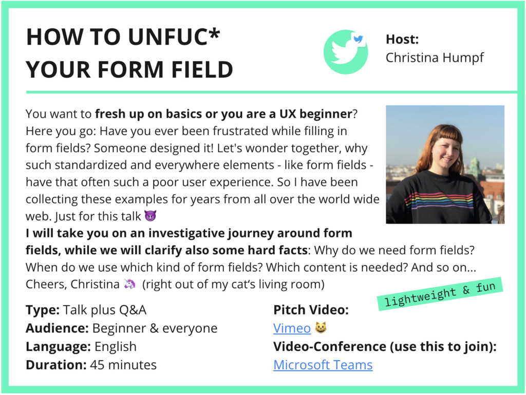
Special thanks for your support Christoph – you were a great and patient test audience. And of course, thanks to the UXcamp Europe org-team, setting up such a remote and community happening for 24 hours. And thanks also for promoting me and all the other hosts upfront the event (with such slides seen on the article header).
See you next year
If you want to join next year’s event, it will be on June 4-5 2022. You can subscribe to the newsletter for details on UXcamp website. I really hope to meet all of you there (again). And if you want to learn about form fields, which I had my this-year’s session about, you can read through my article „How to unfuc* your form field„.

Sources & additional information
UXcamp Europe, organizer website
Session board 2021, from uxcampeurope.org
How to Create an Engaging Virtual Conference (and Build Community): Lessons From a First-Time Attendee,
a further article about the UXcamp 2021 from Chez Boris
Image Source (Header): Portrait by Christina Humpf, slide designed by UXcamp Europe for Linkedin

At first I was apprehensive that I could even read such a lengthy post. Your writing style has captivated me. It was a fantastic piece. Great Article Neil. I have read it a couple of days ago, but didn’t make an opinion, but I felt this article was good enough to merit a mention. you, I’ll be applying the tips on my websites soon!
thought the same 😉 but like to see such small magazines, no?
It’s a shame you don’t have a donate button! I’d certainly donate to this excellent blog! I guess for now I’ll settle for book-marking. I look forward to brand new updates and will share this site with my FB group. Chat soon!
Nice to know – I hope we will have such anti-capitalist meetings forever
Oh hey – I have been there before Covid, it was nice to see how international and open the people where :-O
Question: the barcamp is not remote anymore, right? might sign up for their newsletter. thanks for your insights 🙂
great – lets see if I will make it one day to my a barcamp. sounds fun 🙂