This article is also available in German. / Dieser Text ist auch auf Deutsch erschienen.
Watch out, author is using some explixit language and irony in this text. Also this article is based on a talk at UXcamp Europe 2021. You can view recording at YouTube and read about Christina’s remote barcamp experiences at Creatives Forever. And now let’s get into the form fields! First: The annoyance towards bad design in form field elements results from ten years of professional experience and the fact that these elements have actually been ux basics for decades and are still poor designed and therefore simply annoying. Not meant disrespectfully, but here is the revenge 😉
Checkboxes, radio buttons and especially text fields. Exciting – isn`t it?!? Most of us filled out hundreds of form fields digitally. Some are good, so we forget them. BUT SOME form fields and flows are kinda shitty. While my talk at UXcamp Europe 2021, the remote version, I went through basics of UX: form field elements. This is the related article. After reading through this text you – as ux designers and allies – might have a common understanding around: typical form field fails, how to avoid them, when to use which kind of form field element and of course „How to unfuc* your form field“ forever. Enjoy reading!
And forms are used to collect user input. The user input is most often sent to a server for processing. The HTML <form> element is used to create an HTML form for user input. The <form> element is a container for different types of input elements, such as: text fields, checkboxes, radio buttons, submit buttons, etc. [1] When filling out a form, there is communication endpoint such as the reset button or submit button. To finish user input, there needs to be a defined button for submitting the form data to a form-handler. I found a more memorable definition including a broader purpose of forms, from a true master of forms, Jessica Enders, in her 180-pages-book “Designing UX: Forms. Create Forms That Don’t Drive Your Users Crazy”:
A form […] collects information from at least one party, and delivers it to at least one other party, so a product or service can be provided.
How to form field in general: The content and form field elements are easy to test by using something quick and simple like paper prototyping or something similar. But now: Let‘s learn from forms, that might users drive a bit crazy 🙂
Checkboxes vs. Radio Buttons
Generally, radio buttons were named after the physical buttons used on older radios to select preset stations – when one of the buttons was pressed, other buttons would pop out, leaving the pressed button the only button in the „pushed in“ position. [2] Forms can be made up of standard graphical user interface elements. Squares and a „X“ or a checkmark make a checkbox. A circles and points make up a radio button.
Potential for improvement:
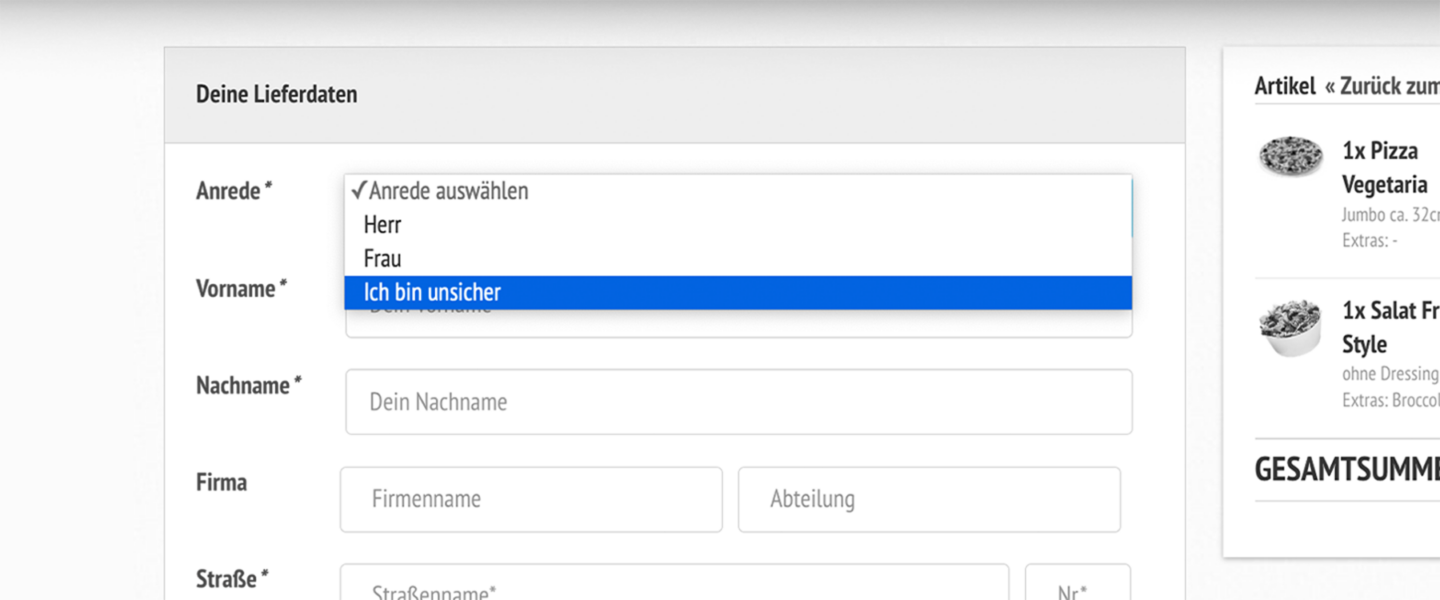
In this example, users might be unsure, where to click, what to click and if both options or answers can be selected due to discrepancy between content and design.
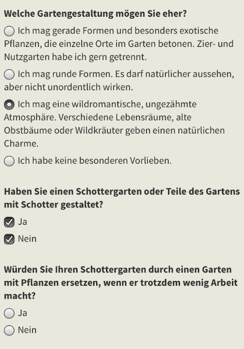
Potentials for improvement, at a survery around garden preferences and gardening:
- First question is around users‘ most preferred garden design; Answer options are selectable radio buttons with long, a bit biased (exotic, tidy, natural, no preferences) answer oportunities. But thinking about context: why do users have to prefer just one option? And wouldn`t it be nice, to have a text field for individual preferences?
- On the second part “Did you design your garden as a stone-ish, gravel garden / partly gravel garden?”, users get a „Yes“ and/or a „No – option. AND we have Check boxes. Thats not very lucky – Why should users could choose yes AND no.
- Better you choose Radio Buttons, if you want to force users to choose only one answer (and thats a huge IF).
How to Checkboxes vs. Radio Buttons
So first tip here for any checkboxes or radio button design on digital forms: If you are designing checkboxes and radio buttons today, be aware that they should look and behave like well-know patterns.
- Reminder / “Eselsbrücke”
- Only One Option → use: RadioooO Buttons
- Single and more options → use: Checkboxes
- Number of options
- more than ≈ 6 options → instead of Checkboxes, use: Dropdown, Text field etc.
- just one option and / or if you want users force to select → use: Checkbox
- Content & Context
- be careful, when providing Radio Buttons and Checkboxes together → risk of confusion!
- design selectable areas who include content → clickareas might be to small to tap
- if it’s not mandatory to answer → make sure users can clear options (also Radio Buttons)
- be careful, when providing Radio Buttons → humans are complex!
Text Fields
A text field is a simple text box that allows input of a single line of text. [3] Sometimes are also textareas given. It is designed much like text input fields (aka ´text box‘), exept textareas allows multiple rows of data to be shown and entered. With text fields, we want to force users to type everything in – form their names, to email adresses, to phone or credit card numbers, individual input text (e.g. in a survey) and of course: passwords.
And if a user filled in correctly, the user’s input needs to be validated, right? Well yes. AND no. What if this goes wrong? Lets see some really bad text input examples, weird error messages and input restrictions. It is time to shed light on the consequences for some shitty user stories:
*Ironic user story alert*
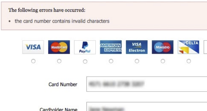
We want users to enter the Credit Card Number like its shown at the credit card. But this is not possible! Because this ‘Credit Card Number’ field example do not allow or not even auto-format spaces, like 80% don’t. [4]
*Ironic user story alert*
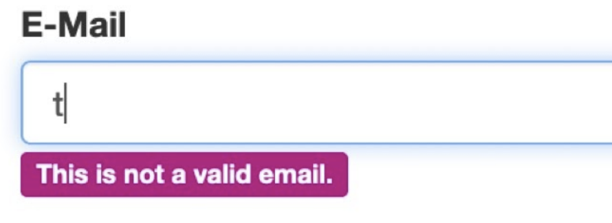
While typing their first charakter in (for example for a e-mail address) we want users, to know, that they are wrong with their input from the very beginning of typing until they have formatted the input correctly.
*Ironic user story alert*
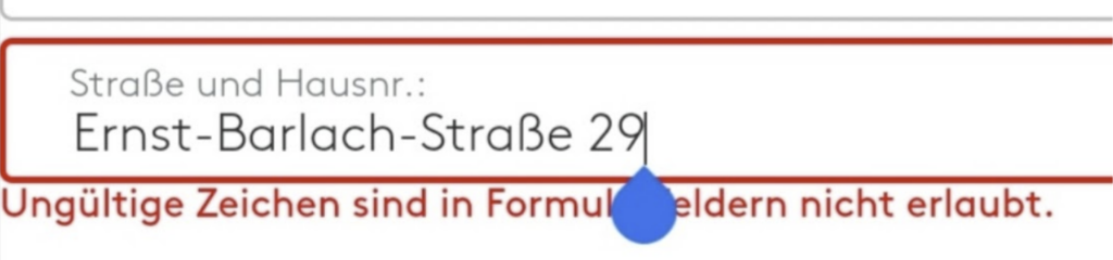
As a form field user… I want to enter my street name and house number. Unlucky me: it is not possible! MAYBE because I live in a street, which name that is written with special characters. So that, I can choose to move in a street without special characters.
*Ironic user story alert*
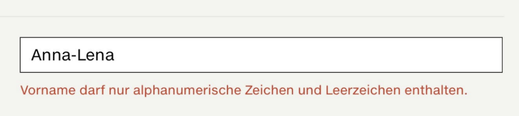
We want users to enter their first name – but made it impossible for some. Because cause Anna-Lena has two first names: separated via a special character. But at least she can enter spaces and numbers here in this poor example. 😀
Beside of user’s frustration, this cause serious problems. Check this example of failed input validation for name text fields
- In Ireland, users are able to renew their driver’s licence online.
- But some people can’t.
- They donnot have access to this mandatory entry process.
But why?
- Well, some where told that their name, which is already used on analog drivers licence (!) is not valid.
- possibly due to failed input validation.
- and on top of that, the error message told this users:
they need to change their name to pass field input validation.
How to Text Fields
Basically, most of these fails with boxes and texts are the ones that keep people from filling out forms. And many input validations and their database fuc*ery restrictions are leading to very serious problems and sometimes dead end for people, who were forced to fill in those text fields. BUT its the stuff which needs to fill out to get a service (such as newsletters) or even to get access. Useless to say: a user cannot change name, street name or similar – just for a shitty form field. But there a solution (one of many): UX/UI Designer, Developer, Strategist and Researcher – it is our responsibility to create barrier- and biased-free text fields! Keep in mind the following:
- If designing basic text fields “Anatomy & States”, provide:
- Label Text + Container: from: idle → to: focus state → to: filled out → to: verified (see „Feedback“ below)
- Input should provide: descriptive placeholder text → so user can fill: input text
- Feedback for users is THE text field essence, so:
- design and test all necessary descriptive message (error/warning)
- design and test reasonable feedback time (when should be a warning/error shown)
- mark mandatory or optional clearly (mostly, better to provide only for mandatory text fields)
- provide additional information, if needed
- provide a character limit, but only if needed
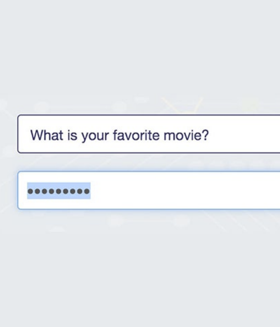
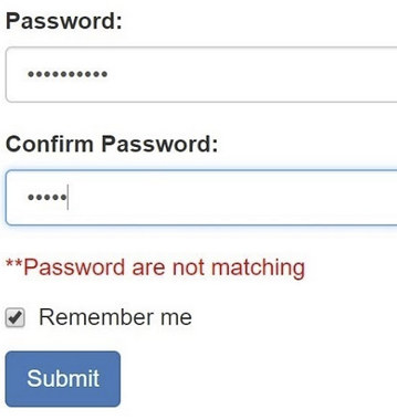
Password or ********?
Password are very similar to text fields, but on top of that: password fields might be used for security purposes. One of the few times, where user can choose their own content. It is up to their imagination, right? But what if characters made invisible and replaced with asterisks? What if users need to confirm an invisible password?
How to Password
Jokes aside…. in conclusion, remember this, if you`re designing password fields:
- 54% of consumers have only five passords or less. This means: passwords are not save (most people even reuse it), but a good design can support security aspects.
- People forget their passwords. If you are designing password form elements, keep this common user flow in mind.
- People need to change passwords regularly (but don’t do it), think about a workaround here (e.g. remember users from time to time, to change their passwort or force them)
- Authentication with two-factors, social/third party, biometrics is real alternative… (or even none is an option)
- Think about alternatives: most of us used slack for a international barcamp for example. But instead of typing out a password on mobile, users have the option to receive a magic link via email, which signs users in automatically. That’s it!
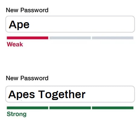
Behaviour & Design
- Limit requirements (generally!)
- Make those few requirements visible
- Show a strength indicator
- Allow to (un)mask password
- No „confirmconfirm confirmconfirm“:
Don’t make people confirm! Yes, there’s power in repetition, but password confirmation fields were largely introduced due to password masking. If you gave people the option to unmask their passwords, the password confirmation field might be not that necessary, right?
Some Input Assistants
Dropdowns, date pickers, calendars, auto-complete and charakter organisation. Let’s beginn with dropdowns, listboxes or rolling picker. Or: combinations of dropdown, listboxes and checkboxes. Or: combinations of dropdown, listbox, checkboxes, search (text) field and auto-complete.
Bad news. Some design patterns might die soon: hence they are repeated over and over again – often without being questioned or validated by data or usability testing. [5] For example, Apple’s role pickers become established design patterns. And are often quite poor ones. Why should we force users to scroll through hundrest of countries, instead of letting them type in…
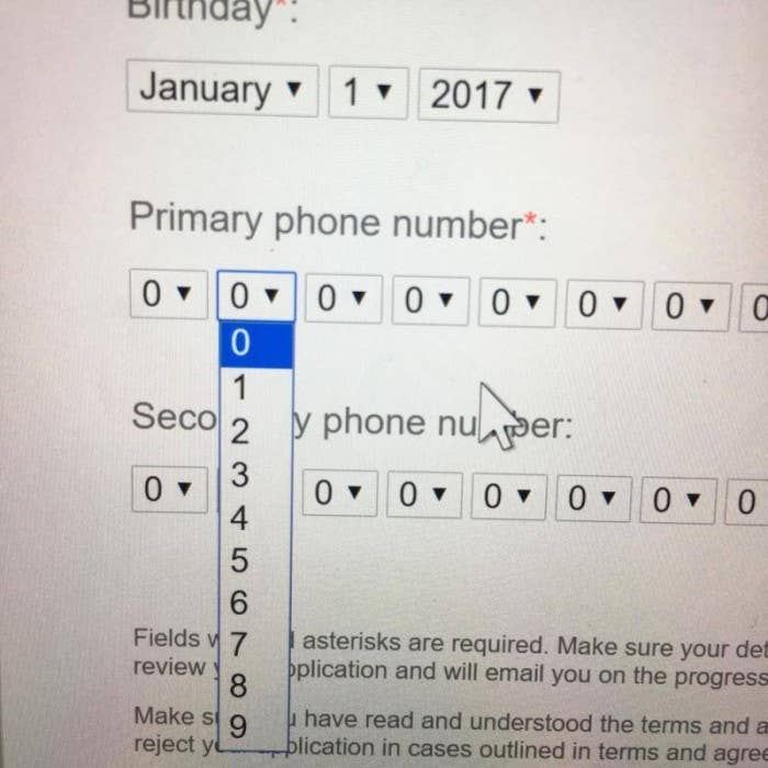
Generally I can highly recommend writing user stories about your form field item. Because: Yes! – You will need dropdowns sometimes. But please watch out for edge cases and do some prototyping and testing.
Lets continue with date pickers… and a shitty love story. If UX people would write a user story on apples date picker, it would sound like…
As an… – iOS user
I want to… – use a rolling date picker that defaults to today and blocks future dates, meaning I have to roll back the years before the date and month, on a device that is made to enter numbers via a numeric keypad
so that… – I can provide my date of birth.
Also, nevertheless if you look at Apple’s rolling picker: it is partly not accessible and also endless searching via scrolling. We can do better. So what about dropdown calendar pickers?
I get it. A date is a very strict and explicit input. And its needed. But a very special place in hell, goes here to some date pickers 🙂
Most examples are only accessible for mouse (or fingers) users… because the keyboard input is disabled.
There is recent article and video on this topic: You can clearly see, an experienced user, who take 52 seconds (!) to provide a date of birth at a dropdown date picker. [5]
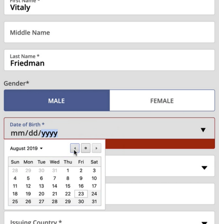
on Smashing Magazine
I can’t write it enough: No. We don’t need a date picker for our date of birth. And it might be also a bit useless to know the weekday of the own birthday… So how to design better for memorable dates? – Form field master Adam Silver argues that using multiple inputs instead of one input is rarely a good idea, but it is a good option for dates. [6] Especially if it’s one an memorable date, like our date of birth, right? 🙂
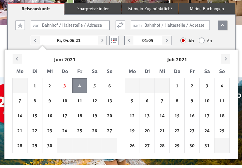
When you need a date picker after all, for example, if you want to book something: the dropdown plus date picker might be a good choice. But not only!
It’s even better INCLUDING an opportunity to type the date in a input field.
Input steppers [7], character organizing [4], auto-suggestion [8]… There are tons of input assistants, dark patters and – of course – improvement opportunities. But for today, let us close with the following:
How to Input Assistants
Drop downs and date pickers might needed, but
- are slow and have zooming issues
- take up a lot of space
- select-opportunities might be confusing (or vs. and?!)
- (mobile) although: they are native accessible by default
Some thoughts on content & context:
- let users type, if they want
- provide an accessible autocomplete
- spaces should not provoke validation errors
- provide auto-formatting
- validate after users entered the form field
Personal User Input
We could continue for hours on the types of form field elements, how to design them, how to avoid common fails and so on, but there needs to be an end. And a lot of great articles (and also books) are already written on this topic. I just want to highlight one last thing:
With form fields we collect personal content about individuals.
This is sensitive data.
So it needs to be designed sensitive.
Because people can`t change themselfes, their names, adress just for form fields. We also need to be carefull, HOW we ask user for information and need to have an eye on, WHY we want to gather this information. Some examples:
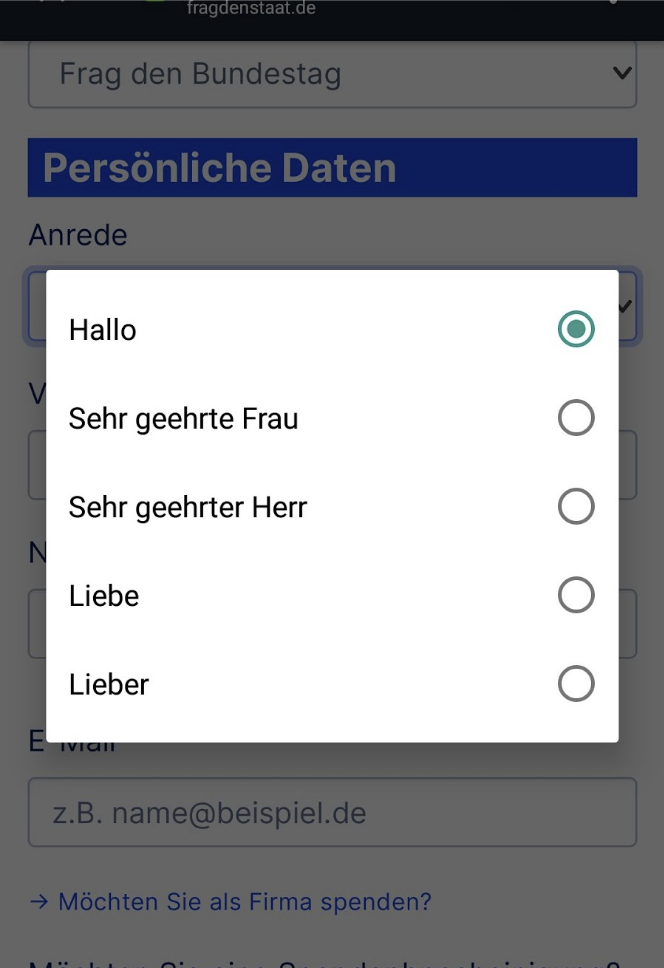
Why are the given genders in this dropdown example is: Mr, Mizz and “I am not sure”? Is this gender inclusive? It is not. Dear designers, please also think about the context: Why do a pizza delivery service ask for customers gender?
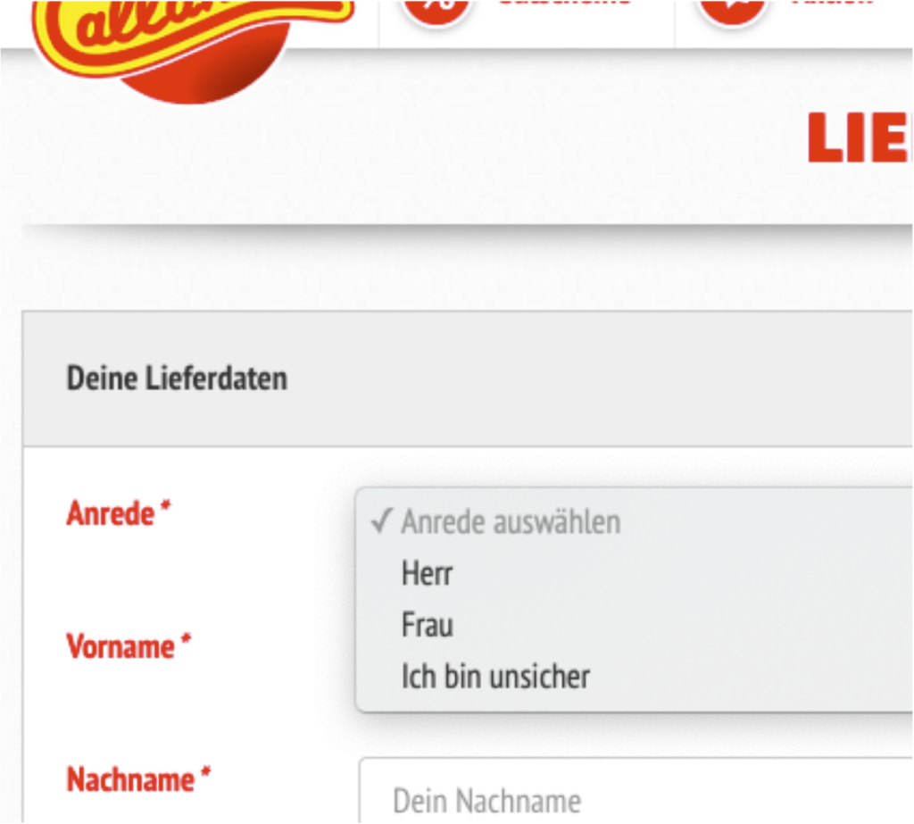
And if they have to do… for whatever reason.. could it be like this.. If its for a written salutation in mails, letters and so on; what about clarifying title and salutation grade with the options: hello / dear Miz / dear mister / or even “dear”. Clarify, if the ask is about customers gender or is it about a title?
Do not mess with names at all. Provide as many cases and charakter combinations as you can image. And then again: test and protoype.
Do you know, what I also can read in many examples? „Not valid“ – and this is the true error. It is wrong. Do we, as the form field designing – people, want to validate individuals? No! Of course not! Coming back to users. Users are individuals, so there are might be no invalid personal input.
So please remember: A form is used to collect user input, not to validate users. And to get this information from people, we design forms. But with forms, users want something to be done. To combine both sides successfully, follow some general UX rules: Design the form and flows as quick and easy as possible. Design to serve the purpose. Design accessible and last but not least: data is key.
My 4 take aways around form fields
- A shitty analog process will be a shitty digital process.
- Just ask the minimum. Just ask after most necessary information. Be careful with mandatory form elements. Keep hurdles low. And as we learned previous paragraphs: personal data are sensitive. So if you don’t raise it, you won’t be in any trouble.
- Text fields might be your “complexity”-end boss, due to restrictions, input validation work arounds and endless variation possibilities. Imagine: We are 7 billion people in this world. If we extrapolate at least two names per individual.. Extrapolate with 26 alphabetical characters, count with special glyph… Please test and iterate especially your text fields!
- Form follows function or with other words: Technology follows user need 😉 No, it should never the other way round. Users are not here to fill any databases: they want something to be done. So please design it that way and lead your stakeholder, backend and frondend developer mates in this direction!
In case of any questions, feedback or if you want to stay in touch: drop me a line on Twitter, Linkedin or leave a comment below. Cheers, and happy Pride Month! Yours – Christina

This article is based on my session at UXcamp Europe 2021 (view recording here). Have you ever been to a barcamp? I wrote also around my experiences at this international, remote barcamp. While promoting this event and my talk, I got a some questions, what is a „barcamp“? What are sessions? So I wrote about my recent barcamp experience. Enjoy reading 🙂
Sources
[1] HTML Forms and HTML examples, from w3schools.com
[2] Radio button Etymology, from wikipedia.org
[3] Text Box, from wikipedia.org
[4] Credit Card Number’ Field and Auto-Format Spaces, from Baymard Institue
[5] Frustrating Design Patterns That Need Fixing: Birthday Picker, from Smashing Magazine
[6] Form design: multiple inputs versus one input, Adam Silver‘ Blog
[7] Input Steppers, Blog by Nielsen Norman Group
[8] 7 Best-Practices für nutzerfreundliches Auto-Suggest, Blog by Userlutions
Image Source (Header): Screenshot from call-a-pizza.de
References
Designing UX: Forms, Book by Jessica Enders, 2016
Form Design Patterns, Book by Adam Silver,2018
Accessibility for Everyone, Book by Laura Kalbag 2017
Best view i have ever seen !
Hello friends, how is everything, and what you wish for to say concerning this article, in my view its genuinely remarkable in support of me.
Have you ever considered about adding a little bit more than just your articles?
I mean, what you say is important and all. But think about if you added some great images or video clips to give your posts
more, „pop“! Your content is excellent but with pics and videos, this website could undeniably
be one of the very best in its niche. Fantastic blog!
Best view i have ever seen !
Woah! I’m really enjoying the niche of your blog. A lot of times it’s challenging to get that „perfect balance“ between usability and appearance. You nailed it, regards – Tam
Wow, that’s what I was exploring for, what a message!
Thanks very nice blog! Looking forward to read something new.
Great blog post! UX and form fields are indeed crucial elements in creating a seamless and intuitive user experience.
As mentioned, designing form fields with clarity and simplicity is essential. Users should be able to understand what information is required and how to provide it without any confusion.
Love to read more soon, Shy
Pretty! This was an incredibly wonderful article.
Thank you for supplying these details.
Hi friends, how is everything, you would like to leave comment.
In my view this text truly amazing written for me.
Hi there to every one, it’s actually a fastidious for me to go to see this site, it consists of valuable information which used for an internal presentation. looking forward to much more of this.
Good reminder. thank you
Thanks for wonderful info I was looking for this information for my mission.
… in order to cultivate a positive reputation and build trust with stakeholders. Great!
Piece of writing writing is also an excitement – thx
Having read this I believed it was very enlightening. I appreciate you spending some time and energy to put this information together. I once again find myself personally spending a lot of time both reading and posting comments. But soo what, it was still worth it!
Hello, of course this piece of writing is really nice and I have learned lot of things from it concerning designing and concepting. thanks.
Thank you for sharing such a sophisticated opinion, the text is really insightful, I actually read it completely
I used to be able to find good information from your blog articles.
I needed to thank you for this very good read!! I definitely loved every bit of it. I’ve got you book-marked to look at new stuff you post…
You really make it seem so easy with your presentation but I find this matter to be actually something that I think I would never understand.
It seems too complex and extremely broad for me. I am looking forward for your next post, I will try to get the hang of it!
Wow! This blog looks just like my old one! It’s on a completely different and cool subject – liked the text
I really like reading through a post that can make designers think. Also, thank you for allowing me to comment!