This article is also available in German. / Dieser Text ist auch auf Deutsch erschienen. Hier klicken!
How well are the 10 usability heuristics from Nielsen represented in the successful smartphone app „Pokémon Go“? After an introduction to the terms „usability“ and „user experience,“ I provide a brief historical overview of Pokémon and Pokémon Go. With the help of Nielsen’s 10 heuristics, I then look at the design of Pokémon Go itself. A practical guide to usability and its heuristics using digital product design in Pokémon Go. Here we go: „Gotta catch ‚em all!“
Every day, we interact with an extremely large number of products. It starts in the morning when we reach for our toothbrush, when we tie our shoes, or even when we scroll through social media on our mobile phone during our lunch break or sit on the couch in the evening and turn on a streaming service.
Products are anytime, everywhere.
No matter if analog or digital.
But not all products are the same. We may be particularly fond of some of them or use them more than others. We turn on the wrong stove top every now and then, or constantly press the wrong button on a website. Or, the all time classic, we run into doors even though they are for pulling (watch this video). But then there are these products that are so incredibly fun to use. Whether it’s the fitness app on your latest smartwatch, the teapot that doesn’t drip, your favorite chair, or a gaming app.
When it comes to products and their use, in product development we call it: Usability or User Experience (UX).
Usability describes the „use-ability“ or user-friendliness of a product through its use by people. In purely functional terms, it is about that users achieve with a product what they want to achieve with a product. The best way to do this is as effectively, efficiently and satisfactorily as possible. Accordingly, a coffee machine has a high usability if it makes the „right“ coffee quickly and easily.
User experience means, well,… „the experience of a user“. In addition to usability, other factors play a role here. For example, the look and feel or the joy of use of a product. The product should not only function, but also be fun on all possible sensory levels and lead to a positive experience for the user (take a look at Wikipedia). The coffee maker will not only make the „right“ coffee quickly and easily, but it will also look good, fit perfectly into your kitchen, feel good when you press the buttons, make pleasant noises, and any operation related to making coffee will bring simply joy.
If usability and user experience are high, then you potentially have a good product in front of you.

In order to make usability measurable, respectively comprehensible, there are the 10 usability heuristics from Nielsen since 1994 (here an article). These serve as rules of thumb that should be followed when developing a new product. In my job as a UX designer, I have found that these usability heuristics help me stay on track when designing products. For me, the 10 usability heuristics are an indispensable part of digital product development.
Pokémon and Pokémon Go
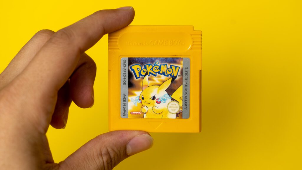
Pokémon – they first saw the light of day in Japan in 1996. At that time, the little „pocket monsters“ were mainly found in GameBoy games, on trading cards, as stuffed toys, in movies, mangas and anime. As a child, I was immediately hooked and had to have everything that had to do with Pokémon. You could say I developed something like a childlike brand loyalty.
Then in 2016, the Pokémon Company teamed up with game maker Niantic and scored the next coup. My fan fire was rekindled: Pokémon Go! Roughly, the app is based on the idea of walking around with your mobile phone to virtually catch your own Pokémon, evolve them, train them, and have them compete in virtual battles against the Pokémon monsters of other app players. There was already a real boom when the app was launched. Pokémon Go players were everywhere (video here). Not surprisingly, the game broke several records and was at the top of the download chart for a long time. Even though the hype is over, the game still has comparatively high user numbers (see this statistic, sorry, it’s in German language) and a stable community. Over the last few years and along several updates, the game has become – in my opinion – an even better and more entertaining product.
Usability and Pokémon Go
And one day I thought: Why not combine my two passions, usability and Pokémon Go? Specifically, I wanted to take a closer look at how well the 10 usability heuristics were taken into account in Pokémon Go. No sooner said than done, and I’d like to share the findings with you in this article.
The summary beforehand: In general, usability is often only noticed when it is not given or not given sufficiently. Because we expect it simply to be there; if usability is not, we are frustrated during use, acceptance drops, and in the worst case, the product is rejected. Pokémon Go is like any other product, a product with potential for improvement. But: I have been able to find all usability heuristics multiple times and well mapped in the app. Pokémon Go not only has a high usability, but also a good user experience thanks to the modern appearance, the many community-driven events, and the integration of augmented reality (AR).
And that makes Pokémon Go something that rarely exists for me: An extremely good, enjoyable product.
Below you will find 10 chapters, one for each of the 10 usability heuristics. Each chapter starts with a theoretical explanation of the heuristic (taken from the nngroup) , followed by an everyday example to make the heuristic more understandable. This is followed by two concrete examples from the Pokémon Go app, in which the heuristic is exemplified and found to be good. At the end you can expect a short outlook and my trainer code! So, have fun reading!
1. Heuristic – Visibility of system status
The design should always keep users informed about what is going on, through appropriate feedback within a reasonable amount of time.
General example: „You are here“ indicators on maps, floor indicators for elevators, battery indicator or power indicator on smartphones.
1.1 Example from Pokémon Go:
Important displaying of status during a raid battle
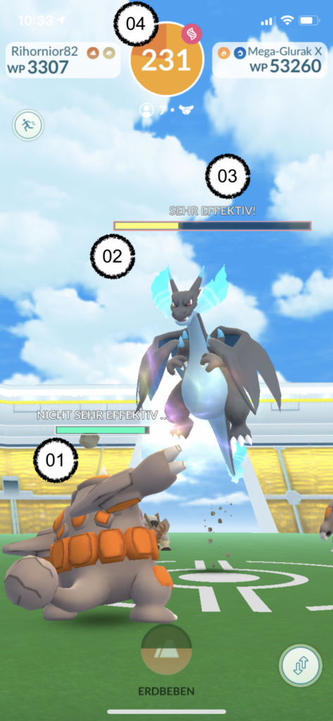
During a battle (Raid) all important information is displayed to the players: The own Pokémon and the remaining energy (see 01 – green bar) as well as the remaining energy of the opponent Pokémon (see 02 – yellow bar). But also feedback on the effectiveness of the applied attack is displayed (see 03 – very effective!). In addition, other important information can be found, such as the remaining time of the fight (see 04 – 231 seconds).
1.2 Example from Pokémon Go:
Status of friends in the friend list
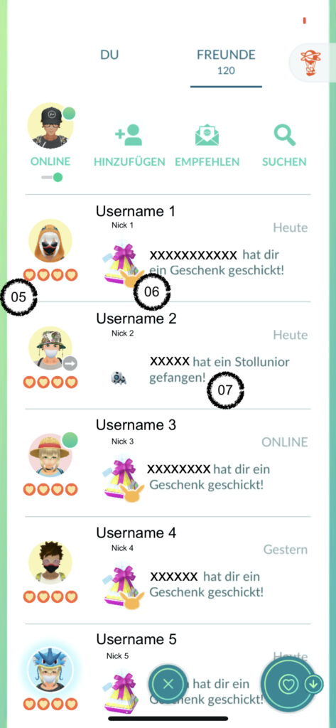
In Pokémon Go it is possible to become friends with other players. All friends are then displayed in a friend list. There, it is possible to interact with your friends in different ways. It is clearly shown which friendship status you currently have (see 05 – four hearts), whether a gift has already been sent to this friend or whether you have received a gift (see 06 – gift item). Other information such as captured Pokémon is displayed (see 07 – Stollunior).
Tip for using the heuristic #1
Show users what is going on. Don’t give too much or too little information, but just the right information. Enable the perfect context-based interaction.
2. Heuristic – Match between system and the real world
The design should speak the users‘ language. Use words, phrases, and concepts familiar to the user, rather than internal jargon. Follow real-world conventions, making information appear in a natural and logical order.
General example: Color red for warnings, compass app, building models in navigation apps
2.1 Example from Pokémon Go:
Movement of the avatar on map
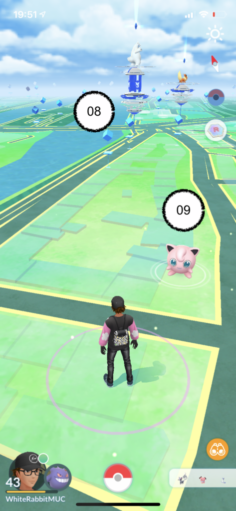
Since Pokémon Go is a location-based game, the transfer from game to real world is easy at first. You can see streets, rivers, and landmarks that exist in reality. The game is an image of reality. It is just enhanced with Pokémon Go-relevant game content, such as Pokéstops, arenas (see 08 – blue structures), or even wild Pokémon (see 09 – pink Jigglypuff).
2.2 Example from Pokémon Go:
Adjusting the outfit of the avatar
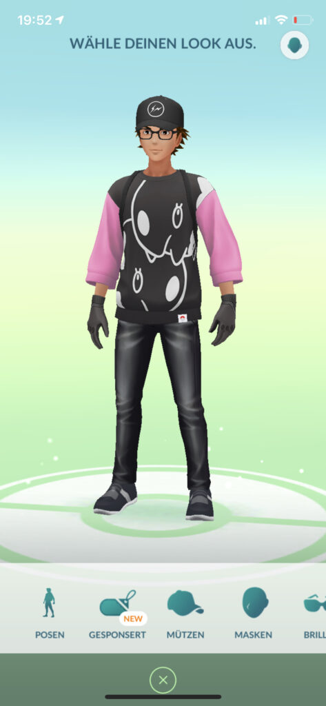
It is possible in the game to individualize your own avatar in a store. Thus, it is possible to make the game character an image of the „real me“. The concept of clothing is familiar and items of clothing can be chosen as in the real world.
Tip for using the heuristic #2
Find out who your users are and adapt the language, look and concept of your system to the needs of your users!
3. Heuristic – User control and freedom
Users often perform actions by mistake. They need a clearly marked „emergency exit“ to leave the unwanted action without having to go through an extended process.
General example: Real emergency exits, „Undo“ buttons, clearly marked „Cancel“ buttons
3.1 Example from Pokémon Go:
Confirmation pop-ups

To prevent users from performing unintentional actions, pop-ups are placed in many places in the game to confirm users‘ actions. This prevents certain actions, such as evolving or leveling Pokémon, from being performed accidentally.
3.2 Example from Pokémon Go:
„Leave“-Button in battles
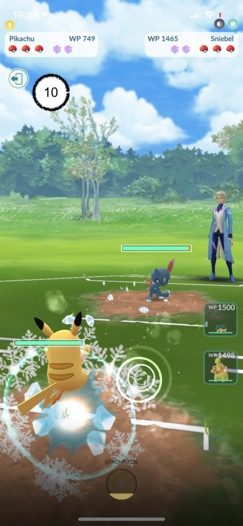
In the various battles, a „leave“ button (see 10 – icon with door and arrow) is always offered. Thus, in every situation, users have the possibility to leave critical moments or encounters in order to limit damage or save resources.
Tip for using the heuristic #3
Users should always have control and be able to undo or cancel actions if necessary. Take away their fear of trying something out.
4. Heuristic – User control and freedom
Users should not have to wonder whether different words, situations, or actions mean the same thing. Follow platform and industry conventions.
General example: Check-in terminals in hotels, structure and workflow of online stores, glossary or style guides for online platforms
4.1 Example from Pokémon Go:
Uniform layout and design language
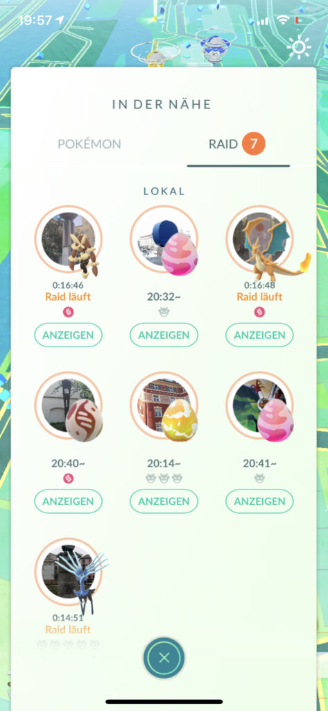
Throughout the entire system, users encounter uniform colors, uniform shapes, and a uniform language. This is evident not only in the color scheme of backgrounds, design of buttons, but also in consistent typography. The „Nearby“ screen is a good example of how a uniform layout and consistency helps with perception.
4.2 Example from Pokémon Go:
Consistency in design
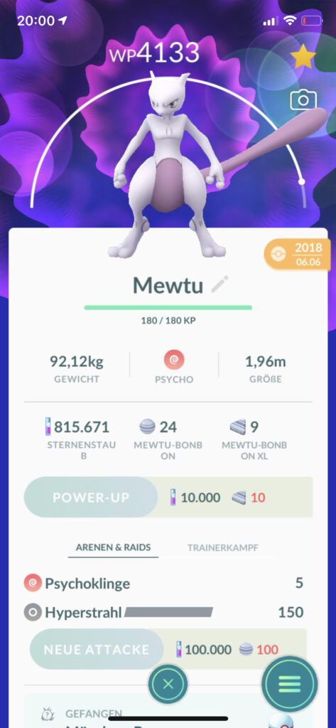
The Pokémon screen (the display of a single captured Pokémon) is also a good example of a „tidy“ screen. Info is displayed clearly, a uniform typeface and the same buttons give the display calmness and consistency. For each Pokémon, the layout looks the same. Even the wording („stardust,“ „candy,“ „WP“) is used consistently – across the entire game.
Tip for using the heuristic #4
Make your app easy to learn by focusing on consistency and standards. This will reduce the cognitive workload of your users.
5. Heuristic – Error prevention
Good error messages are important, but the best designs carefully prevent problems from occurring in the first place. Either eliminate error-prone conditions, or check for them and present users with a confirmation option before they commit to the action.
General example: Guardrails on highways, confirmation popups, warning or error messages
5.1 Example from Pokémon Go:
„Favorite“ Pokémon
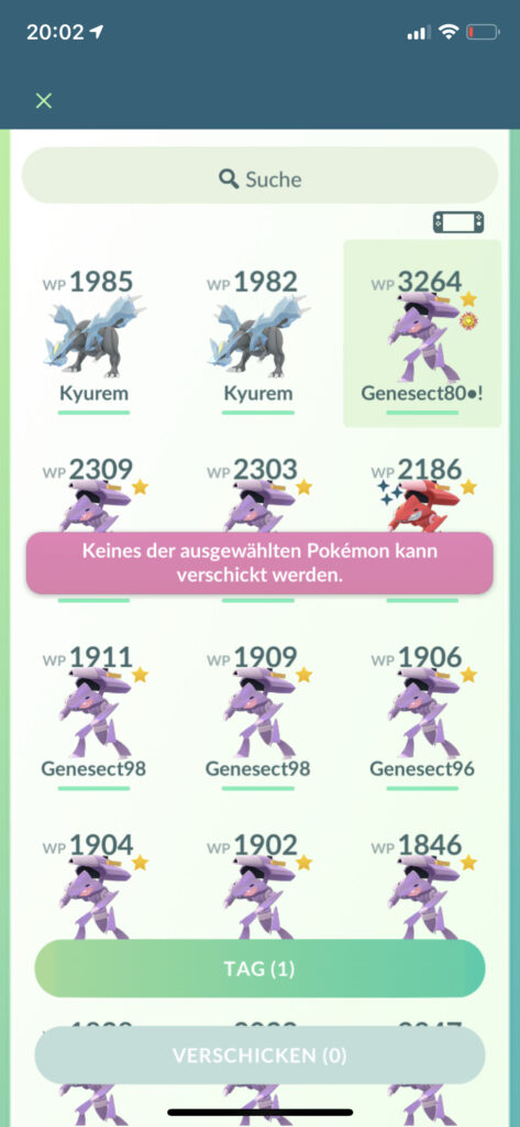
There is the possibility to mark Pokémon as a „favorite“. This helps, for example, to quickly recognize or use particularly strong, important or rare Pokémon. In addition, Pokémon marked as a favorite cannot be transferred. This prevents users from accidentally transferring Pokémon. Nothing can be more annoying than accidentally throwing away your favorite Pokémon. Because gone is gone.
5.2 Example from Pokémon Go:
Transferring Pokémon
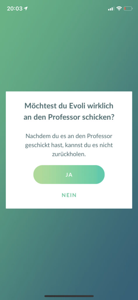
If you transfer (for example) a duplicate Pokémon, you will receive bonbons, which you can use to evolve this type of Pokémon or make it stronger. But before you actually transfer a Pokémon, there is another pop-up query asking whether you really want to transfer this Pokémon. This also helps once again, so that you can not accidentally transfer a Pokémon and thus a possible mistake can be avoided.
Tip for using the heuristic #5
People make mistakes. But: „Never blame the user“. Design for error prevention is essential to avoid annoying users. Confirmation dialogs are a widely used tool for this.
6. Heuristic – Recognition rather than recall
Minimize the user’s memory load by making elements, actions, and options visible. The user should not have to remember information from one part of the interface to another. Information required to use the design (e.g. field labels or menu items) should be visible or easily retrievable when needed.
General example: Menu ribbon for applications like Word, street signs, log-in pages
6.1 Example from Pokémon Go:
Item list
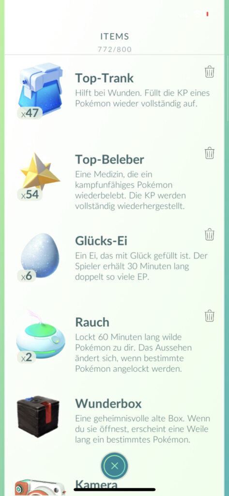
For example, to catch, train or heal Pokémon, there are various items. These auxiliary items always speak a clear language through their symbolism. They are used continuously throughout the system, which makes recognition very easy at some point. This is also supported on the one hand by the fact that the items stand out well from each other, and on the other hand analogies are made to real items (eggs, potions, candies, etc.).
6.2 Example from Pokémon Go:
Buddy Pokémon screen
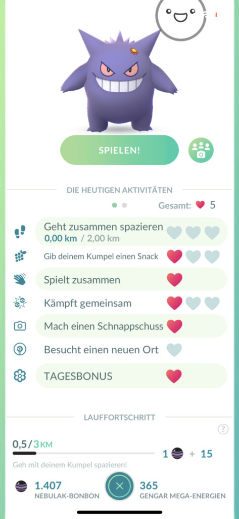
Here, too, some elements are applied to make recognition easier. Not only is there a consistent icon language or wording again. The graphics are also self-explanatory.
Tip for using the heuristic #6
Remembering is error-prone, so information should be presented in such a self-explanatory and simple way. UI elements should help recall so that it is immediately clear what can be done.
7. Heuristic – Recognition rather than recall
Shortcuts — hidden from novice users — may speed up the interaction for the expert user such that the design can cater to both inexperienced and experienced users. Allow users to tailor frequent actions.
General example: Copy paste, abbreviations on maps, individualization of layouts
7.1 Example from Pokémon Go:
Giving nicknames to Pokémon
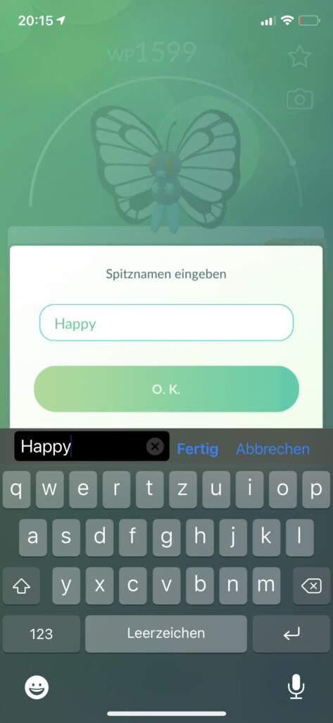
To help users sort or find Pokémon in their inventory, it is possible to give Pokémon nicknames. Of course, this is not only to make certain Pokémon easier to find or more concise, but also to give them an individual touch. This not only provides flexibility in the game. It also makes the game more efficient for users who want to keep track of a large number of Pokémon.
7.2 Example from Pokémon Go:
Multiselect of Pokémon
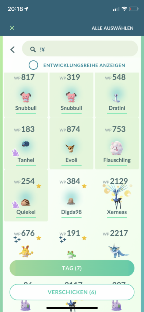
A feature that is also known from other applications (such as gallery apps on smartphones) is the multiselect. Several Pokémon can be marked in order to perform a common action, such as assigning a tag or sending them together. For users, this shortcut makes it much more efficient to send many recently caught Pokémon at once than having to do it individually.
Tip for using the heuristic #7
A (digital) application should be easy to use for daily power users as well as for complete beginners. Not only short commands or individualizations help, but also a clear information hierarchy.
8. Heuristic – Aesthetic and minimalist design
Interfaces should not contain information which is irrelevant or rarely needed. Every extra unit of information in an interface competes with the relevant units of information and diminishes their relative visibility.
General example: Safety-relevant input steps, teapots, dialog boxes
8.1 Example from Pokémon Go:
Pop-ups and dialogues
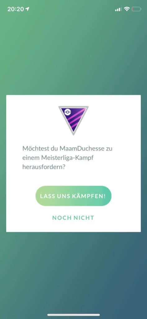
There are places in the game where you are asked again whether you really want to perform an action. In order to ensure that this is not the case, any unimportant information or distraction is dispensed with. The background is reduced and superimposed, the question is formulated briefly and clearly, and the choices are precise and unambiguous. As little information as possible and as much as necessary.
8.2 Example from Pokémon Go:
Catch screen for Pokémon
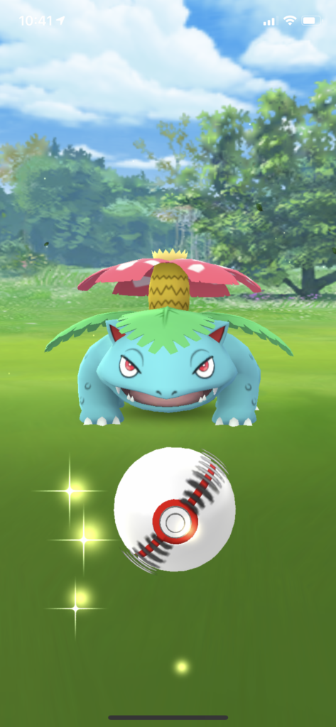
Catching Pokémon has also focused on the most essential things, namely the Pokémon and the Pokéball. Add to that the catching circles and some background, and that’s it. Although everything on the screen is still quite colorful and dynamic, it is contextually focused on what is important, namely catching the Pokémon. Thus, despite reduction, no gameplay fun is taken away.
Tip for using the heuristic #8
The central point of every application is and remains the relevant information. The system should provide maximum support to users in achieving their goals via visual elements.
9. Heuristic – Help users recognize, diagnose, and recover from errors
Error messages should be expressed in plain language (no error codes), precisely indicate the problem, and constructively suggest a solution.
General example: Error messages, one-way street signs, field help on online forms.
9.1 Example from Pokémon Go:
Error messages
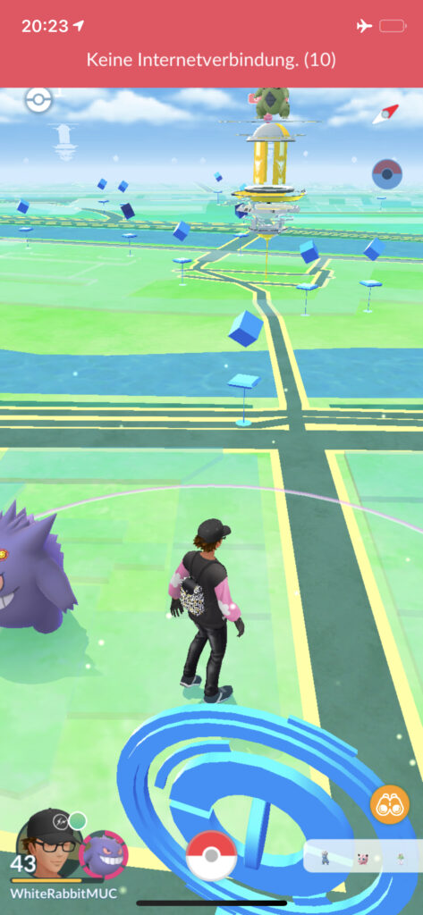
If there is an error in the game or there is incorrect operation, the app reports this back. Care is taken to ensure that the error message is meaningful. Cryptic error codes that do not help are avoided. In addition, possible solutions are provided. In this way, a user knows immediately how to correct the error.
9.2 Example from Pokémon Go:
A little help from the mentor
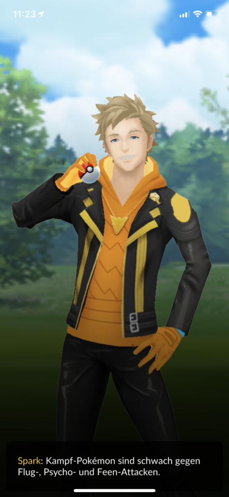
In the game, users are given tips at appropriate points via a virtual trainer or team mentor. For example, if you have lost a battle, the mentor will give you tips about the effectiveness of attacks, which may help you to use more effective Pokémon in the next battle in order to win it.
Tip for using the heuristic #9
Should an error occur in the system or incorrect operation, it is indispensable to help the user. Not only should errors be detected quickly, but it should also be possible to correct them.
10. Heuristic – Help and documentation
It’s best if the system doesn’t need any additional explanation. However, it may be necessary to provide documentation to help users understand how to complete their tasks.
General example: Help pages, information desks at the airport, manuals
10.1 Example from Pokémon Go:
Tips and tricks
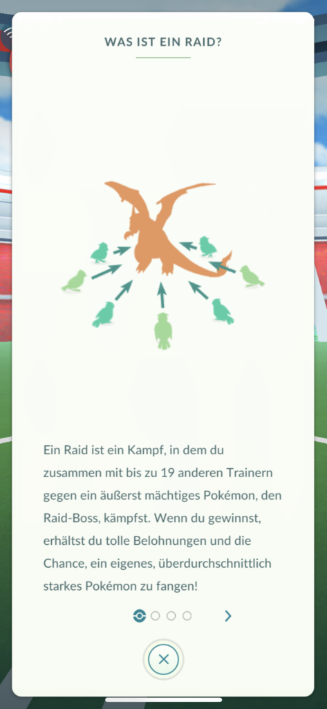
At many points, the app offers help via question mark icons. This explains exactly what raid battles are, for example, for new users. It is important that this information is offered in context.
10.2 Example from Pokémon Go:
Diary
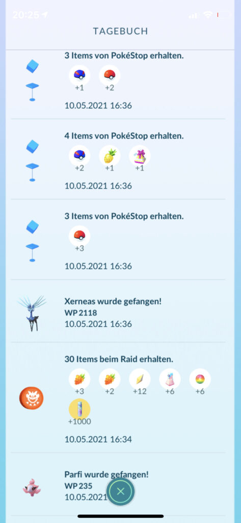
In the „personal area“ there is a section for the diary. There you can see what has happened recently. Captured Pokémon, received items, completed battles, and so on. This documentation can be helpful if you have overlooked any of the information or want to review information again.
Tip for using the heuristic #10
Documentation for help should always be provided, even if the application is not very error-prone. This should be offered context-based and support users in the next steps.
User experience as something that never stands still.
This article is mainly about what I have experienced and observed with Pokémon Go over the last five years. The screenshots represent the state of the game version 0.201.1-A-64 on 05/10/2021 (or older) on an iPhone X with iOS 14.4.
In principle, it can be said that usability, but above all the user experience, is something that is always evolving, is alive, and never stands still. Nothing would be more fatal than to leave a product that is successful on the market to its own. Regular updates and above all feedback from users as well as constant evaluation are essential to constantly improve a product and increase the range of functions. In my opinion, Pokémon Go has managed to never stand still. Constant minor improvements, new game mechanics, and entirely new features have motivated me, and I’m sure other players as well, to want to dive into the world of the pocket monsters again and again. And for sure the game was developed along the 10 usability heuristics. This shows that it always makes sense to take usability into account during product development. And since usability is part of the user experience, this is also positively influenced. Thus, it is always possible to let oneself fall fully and positively into the game.
A side thought that a colleague brought to my attention should be noted here. Pokémon Go may have many reasons for its success. If you take a closer look, for example from a psychological perspective, you realize how many „basic human needs“ are addressed here: you can hunt, collect, catch, strengthen, care for, fight, and trade Pokémon. But also elements like gifts, competitions, surprises, exploration, playing, bragging, community, Second Life, all this finds place. Quite cleverly and subliminally marketed.
Finally, thanks for reading, feel free to leave me your thoughts in the comments and last but not least, if you want to connect with me in Pokémon GO, here’s my trainer code: 1979 0421 9919 (may have expired by now). If you’re hooked and want to start playing too, feel free to use this referral code for great specials: KTR3BJQP9. Please let me know, if you connect. So, without further ado:
»GOTTA CATCH EM ALL!«

nice post. very impressive . very well written
This is a good tip especially to those new to the blogosphere. Simple but very precise info… Thanks for sharing this one. A must read post!
Nicе post. I used tо be checking continuously this blog
and I’m impressed! Very useful info specifically the fіnal part 🙂 Thanks and best of luck.
Hey people!!!!!
Good mood and good luck to everyone!!!!!
I love Pokemon!!